pyramid-plate-popup
Let me start with the things that I love about this change:
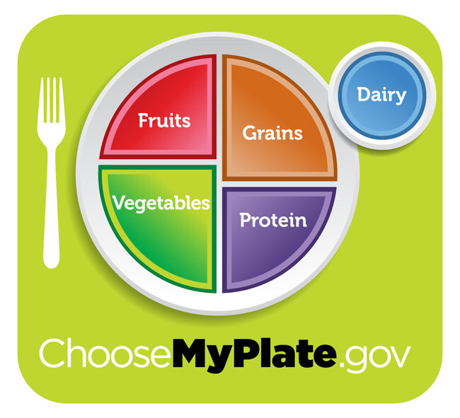
1) Vegetables and fruits are half the plate. Vegetables more than fruits. Yay. I'd love it if they said "Fresh or Frozen Fruits", 'cause you know those canned peaches aren't really that good for you.
2) They say "Protein" and not "Meat", although meat is probably what people think of first when they see the word protein. When you scroll down on the website and click on "What is Protein?", however, they talk mostly about beans as a source of protein and fiber. I'd love it if they said "Beans and other proteins" instead.
3) They say "Grains" instead of "Breads, grains, and other starches". On the website they say at least half your grains should be whole grains.
4) Dairy is off to the side (I wouldn't mind it being excluded, but I understand that the USDA can't do that to the dairy industry).
5) Sweets, oils, etc aren't on there, as in, they are not recommended. That doesn't mean that people don't eat them, but it doesn't appear like the government is actually endorsing them.
6) Honestly, I just like the visual better, because people (especially kids) can look at their own plate and evaluate it.
What do you think? Pyramid vs Plate?
Vote here, and feel free to comment with your ideas.[polldaddy poll=5107156]